Background
This is an online design competition organized by the AAPD, where teams work together to complete a comprehensive product design project in seven weeks (Oct 2023 - Dec 2023).
My role
I served as a lead UX Researcher and worked alongside five teammates: Lin, Ian, Michelle, Morris, and Lulu. I mainly conducted pre/post-interviews and survey, also leading the team to analyze user insights.
Project Goal
In this challenge, the Bus+ company mainly wanted to optimize the existing core experience so that users would not be lost and the user base would be expanded. Hence, our goal is to increase the willingness of Bus+ users to favorite stops through Redesign, which would, in turn, lead to an increase in the retention rate.
User Research
Pre -Pilot
Using some simple questions to ask friends and relatives who use the "Bus App", in order to quickly and initially understand the pain points of the users, which will also help us to design the subsequent questionnaires and in-depth interviews.
We identified two key weaknesses of the Bus+ App:
Experience of searching for bus schedules: The information on the homepage is too complicated, which affects the efficiency of searching for bus schedules.
Experience of route planning: Maps' route planning function only provides bus schedules, which is not as diversified as Google Maps (car/motorcycle/bicycle).
Survey
We used a questionnaire survey to understand the features that users value in existing bus apps and further collected 49 vaild feedback from those who have used the Bus+ App to identify problematic areas.
The top usability issue is that the homepage has too many functions and information.
87% of users prioritize the function to check bus schedules and arrival times.
67% of users use Google Maps to assist in looking up bus-related information.
Interview
Interview users on their experiences using transportation and bus apps to understand their needs and pain points. Moreover, through scenario exploration tasks (searching for bus routes, checking the nearest bus stops, planning routes, and favorite stops), to learn about user habits and thoughts.
User Insights:
1. There is too much information on the homepage, which affects users’ primary needs.
2. Users rely on the advantages of different apps for route planning and need to switch between them to confirm information.
3. Users with “non-fixed starting points” have low interest in favoriting “frequently used route stops.”

Organize interview findings to identify common user pain points

Use a prioritization matrix to evaluate and address the most urgent issues first
Design Strategy
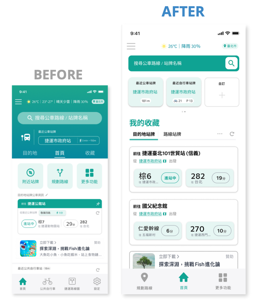
1. Redesign homepage
Reevaluate user needs, streamline the interface structure and functions and reduce distractions
Adjust label names to make it clear to users
2. New Features: Destination bus stops
Provide schedule information from the “nearest stop” to the “destination stop,” significantly increasing users' willingness to save stops on non-fixed routes.
Quickly view different schedule information for a fixed destination, reducing the need for users to switch between different apps for route planning.
After two iterations with users, we finally came out with the final design
Reflection
Business Value Validation
Expanding use cases and increasing usage:
Previously, the favoriting feature only allowed users to save bus routes for specific lines. Our new feature, “Destination Bus Stop,” helps users easily view routes to a fixed destination from any location, making it more convenient.Reducing user steps and lowering churn rate → Improving retention rate: The “Destination Bus Stop” feature eliminates the need for users to switch back and forth between Google Maps to check bus schedules, reducing the chances of users switching to other apps, thus increasing app retention.
Personal Note on this challenge
This was my first product design challenge, and at the start, I felt uncertain about whether I could truly solve user problems within a tight seven-week timeframe, especially while balancing my senior year in college. Through this challenge, I learned two key lessons:
Always prioritize early validation, particularly when time is limited. Don’t keep your concept too distant from user feedback.
Ensure that your solution aligns with both business goals and user pain points. Tools like weighting matrices can help. If a solution doesn’t fully meet both criteria, focus on what users truly need—this approach rarely leads you astray.
I am grateful for my teammates from diverse backgrounds, whose unique perspectives enriched the project. Our remote collaboration taught me the value of effective communication and teamwork, even when working entirely online.
Award Certificate